logo mark logo text
UI/UX Problem Solver
Main Image

Nest x Lowe's Concept Project

What would a software and immersive user experience look like if Google Nest and Lowe's had a partnership? What would make a user interact with in-store marketing? What information is needed for a back-end retail software? These questions were the basis of this entire project. My peers and I began this project in a group, (in order to develop the basic structure of the software) but we ended it with different design and immersive solutions. This project encompassed B2B and B2C marketing skills, and allowed us to fully show off our ability to think through complex UX problems.

Image One

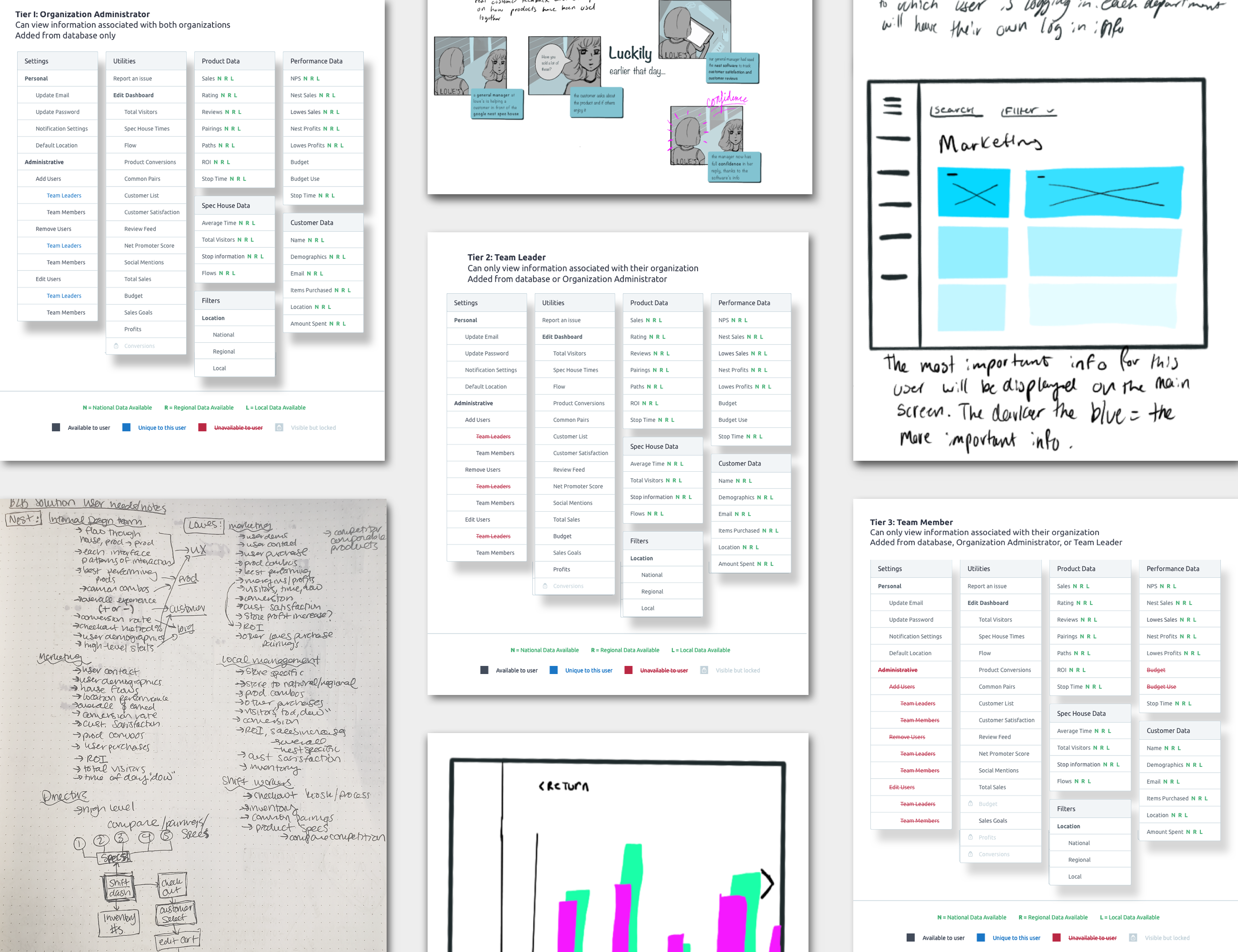
Research and Planning

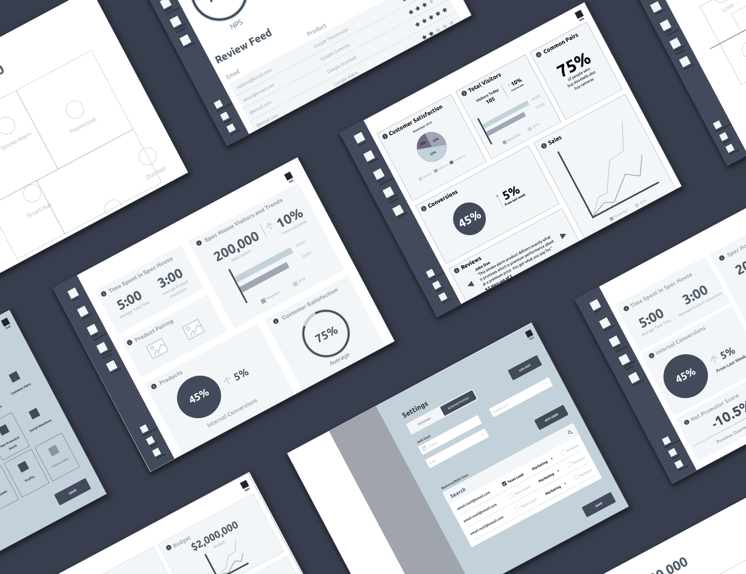
To start any project, extensive research is needed. We researched best practices for tablet software, how users scan information, who uses this type of software, what their day looks like, why people would use the software, the Google Nest product line, and what type of information is most important for our users. With this information, we were able to identify our 4 main users: marketing departments, local employees, higher-ups in the company (directors), and the immersive experience design team. This then broke into a three tier system, resulting in 12 users total. We began creating storyboards, inspired by empathy maps, representing how our users would interact with our software, and what they did, felt, said, and thought while using it.

Initial workflows began developing, and we focused on three main happy flows: directors, local employee, and marketer. Each of the 12 users would have their own dashboard, automatically customized to that role. This allows the user to see relevant information for their daily tasks, while still having the option to edit their dashboard. Depending on what tier the user falls on, some information is restricted. For example, a Lowe's local employee is not able to see Nest's yearly sales.

Image Two

Content Structure

Once our workflow was complete, wireframe sketching became much easier. We knew our overall content hierarchy, so the only thing left was detailing how each page would create a seamless interaction. Using an existing wireframe toolkit, we dissected these elements to create our unique pieces. After agreeing upon a basic layout (left main navigation bar, right secondary navigation, etc.), we were able to split off to create different pages. We would meet twice a week to ensure all wireframes are staying consistent, and to brainstorm any difficult problems we faced.

We created four prototypes, three for our happy flows (directors, local employee, marketer), and one centralized location to house all screens. We then set out to conduct two user tests: 3-second test, and an interactive test on UserTesting.com. The 3-second test allowed us to see what users noticed first; we learned we needed to add names with our icons, and we learned that some of our charts were competing with each other. On UserTesing.com we discovered that our labels were unclear, and our information density was uneven throughout. We had many brainstorming sessions to improve our wireframes, and we then created updated prototypes.

Image Two

Design

For the rest of this project, we worked independently. However, we would still do stand-ups every week to brainstorm solutions, and push each other further. To begin the design process, I decided I would like to focus on dark-mode for the software. It was a highly known trend during that time, and I wanted to see if I was able to create something clean and easily read on a dark screen. I began mood-boarding, and researching the best practices for creating in dark mode. Once I had a solid vision, I began sketching. I would sketch whenever I had the chance, like at my part-time job, or in-between classes. I fell in love with creating a seamless software.

balh

I began designing in Sketch, and I spent hours recreating screens. To ensure I was developing the best design possible, I often had my instructors give me feedback. Even when one instructor told me they could provide no more feedback, I would find another to give new insight. After weeks of redesigning, redesigning, redesigning, I created my prototype. This meant I was ready to move onto the B2C portion of the project: an interactive and immersive spec house, located in Lowe's stores, that gives in-depth information about Google Nest products.

Image four

B2C Immersive Design

To begin this immersive experience, I first needed to understand what technology existed and what was possible. I wanted this concept to be an easy, affordable, effective way for Google Nest to house their products. I researched what types of interactive technology was already being used in retail stores, and what was still in trial stages. The most effective feature I had found was the ability to buy products from your smart phone instead of waiting in a line at checkout. I also found two key problems: bottlenecking at the products, and collecting users emails.

My concept solves these problems. The spec house would be set up like a basic two-bedroom home, and every product would be placed in the normal location: the doorbell by the door, the Google Hub in the main living space. A sign in front of the spec house reads: "Welcome Home! Turn on your smart device's location to explore your future smart home." Once the user activates the GPS, a web app will show up on their phone. A small walk-through will explain how the app works, and get the user familiar with the experience.

Image five

white

The main screen will first show all 7 products, but they are greyed out. Once a user interacts with a product, it will appear "unlocked." This is a visual representation of what product the user has interacted with, and what they still need to find. As an incentive, if the user interacts with all 7 products, they will receive a $10 off coupon. In order to get this discount, the user will have to provide their email address. On the main screen, the user is able to add any product to their cart, and check out on the app. They can chose to have the products delivered to their home, or to pick them up at a service-desk kiosk before leaving Lowe's.

This app allows the user to scan the QR code next to each product and engage with the Google Nest tutorial. After scanning a product's QR code, the user can drift through the spec house while learning about the product. Since they do not need to be in front of the product to engage it, this will reduce the bottlenecking.

Image Two

User-Facing Design

The web-app is designed to engage the user in a playful manner by using illustrations and simple animations. Even with this playful side, it is still the clean, readable brand that Google Nest represents. The brief copy on every screen adds a sense of ease to the experience. The user does not have to feel weighed down by information while learning about each product Nest offers. Each product is greyscale, with sharp blacks and stark whites. To contrast this, the dark purple gradients make the bold products stand out on the screen.

blah

After the design was finished, I created a prototype in InVision. However, this prototype did not truly represent what I had wanted to achieve with my design; I couldn't add in any animations, and the flow did not seem accurate. To combat this, I created a timeline gif is Adobe Photoshop. I was able to space out every transition, and every text animation. This design pulls the B2C immersive concept into something the user is comfortable with, instead of interacting with an all brand new experience. By using their own smart device, the user will feel at ease and in control of their experience.

VIEW ALL PROJECTS

GET IN TOUCH

VIEW RESUME