

Dayton Cars and Coffee, DCC, is an event held from May through August, every other Saturday. Car lovers from all over Ohio, and the surrounding states, come to the event to show off their rides, talk shop, and drink coffee. The founder of DCC came to us with a problem. He was struggling to gain engagement during the off-season months. He had a high bounce rate, a non-innovative website design, and an inconsistent brand across platforms.
VIEW CASE STUDY BOOKLET
This project was split between two courses: Branding and UI/UX. I worked on both sides of the project. We started with client meetings to get to know the real DCC brand. We discussed wishes, needs, and brand voice. Next we went through multiple internal logo rounds, landing on three to refine, and then picking two for the client. Two teams were created to develop brand guidelines and assets to align with the logos chosen. Revisions were made and presented, then a direction was chosen.

The UI/UX team worked in three phases: discover, design, and deliver. While the branding team worked on developing brand guidelines, we started the discover phase. After the brand guidelines were completed, we were able to begin the design phase. We started with six internal comps, and chose three to present to the client. A direction was chosen, and the Art Director role was assigned. The remaining pages were created. We user tested this design, and moved on to the deliver phase.
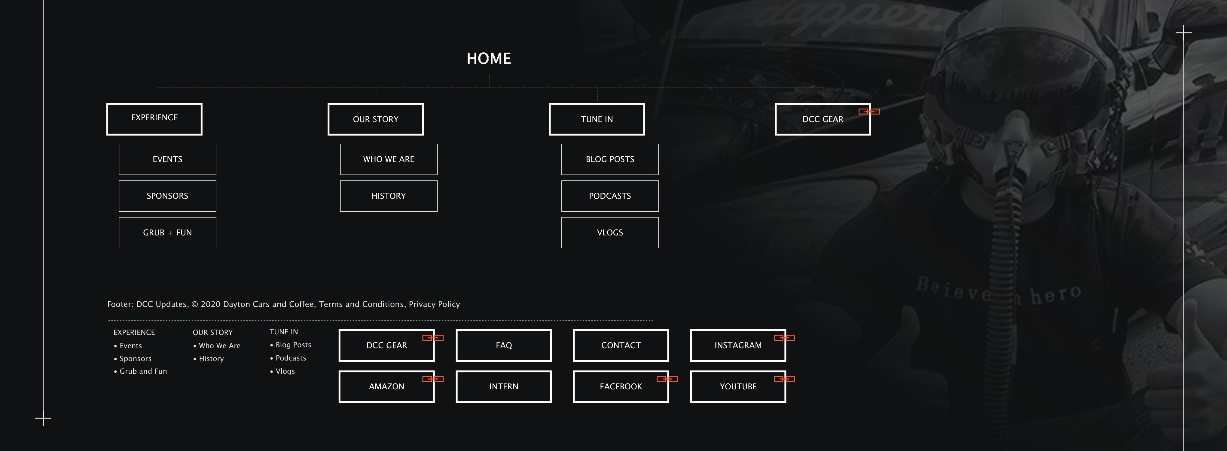
To rebrand the company, I worked as an asset designer to assist in creating a new brand image. I participated in client interviews, presented brand ideations to the client, and created a mock-animation and style-scape to represent the new brand identity.
I also held the position as UX Researcher. In the discover phase, I led the secondary research. This included six audits/analyses to conceptualize the existing landscape. I housed and assessed the data, created findings and recommendations, and presented this to the client.
During the design phase, I assisted the UX Designer in creating the overall flow, site map, and wireframes. I also worked as a designer alongside my other team members.
Once in the deliver phase, I developed the InVision prototype, the user test, and I created a user testing highlight reel.
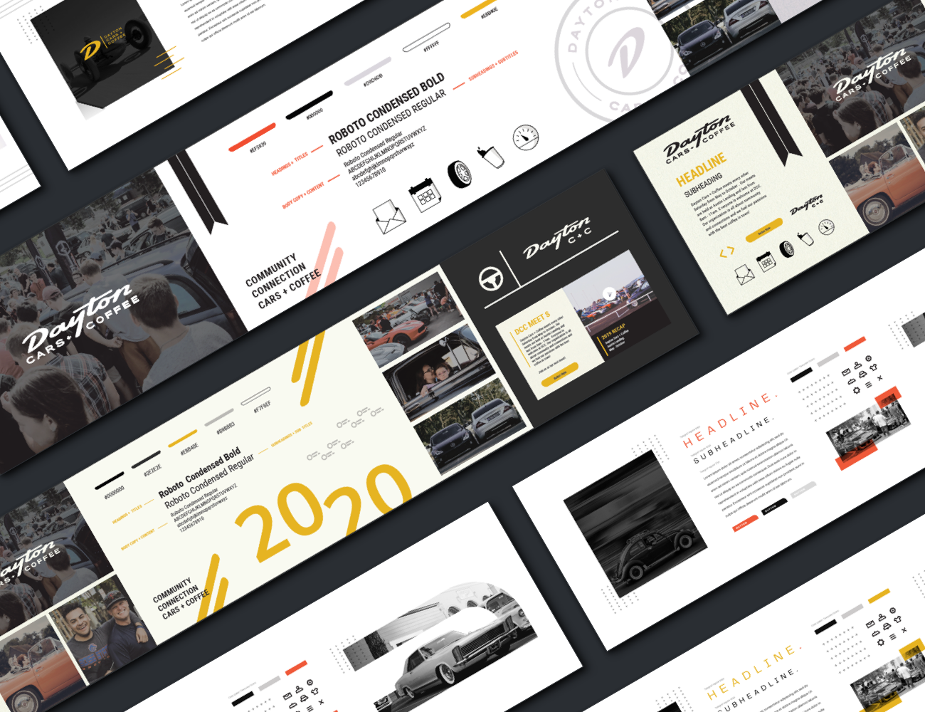
Both teams started working right away and created unified stylescapes. We were then able to split up specific assets to create brand guidelines and merch examples. Our client felt he had not seen enough from either side to choose a direction yet, which was perfect since we had not shown him any extended assets yet. Our client made revision suggestions to both teams, and urged us to push further. He favored the “rorange” color over the yellow, and suggested we try using it on both brands. Our client also wanted to see a combination of the two brands.

Our client struggled to choose a direction for some time, but ultimately choose to go with the more modern approach to the brand. The “rorange” color was picked. While the digital team began to research, the brand team was able to further develop merchandise that will be hosted on our client's e-commerce site, Fuel and Tires. Event signage was also created to integrate the brand throughout the user experience. All of these elements add a more tangible aspect to the DCC brand.
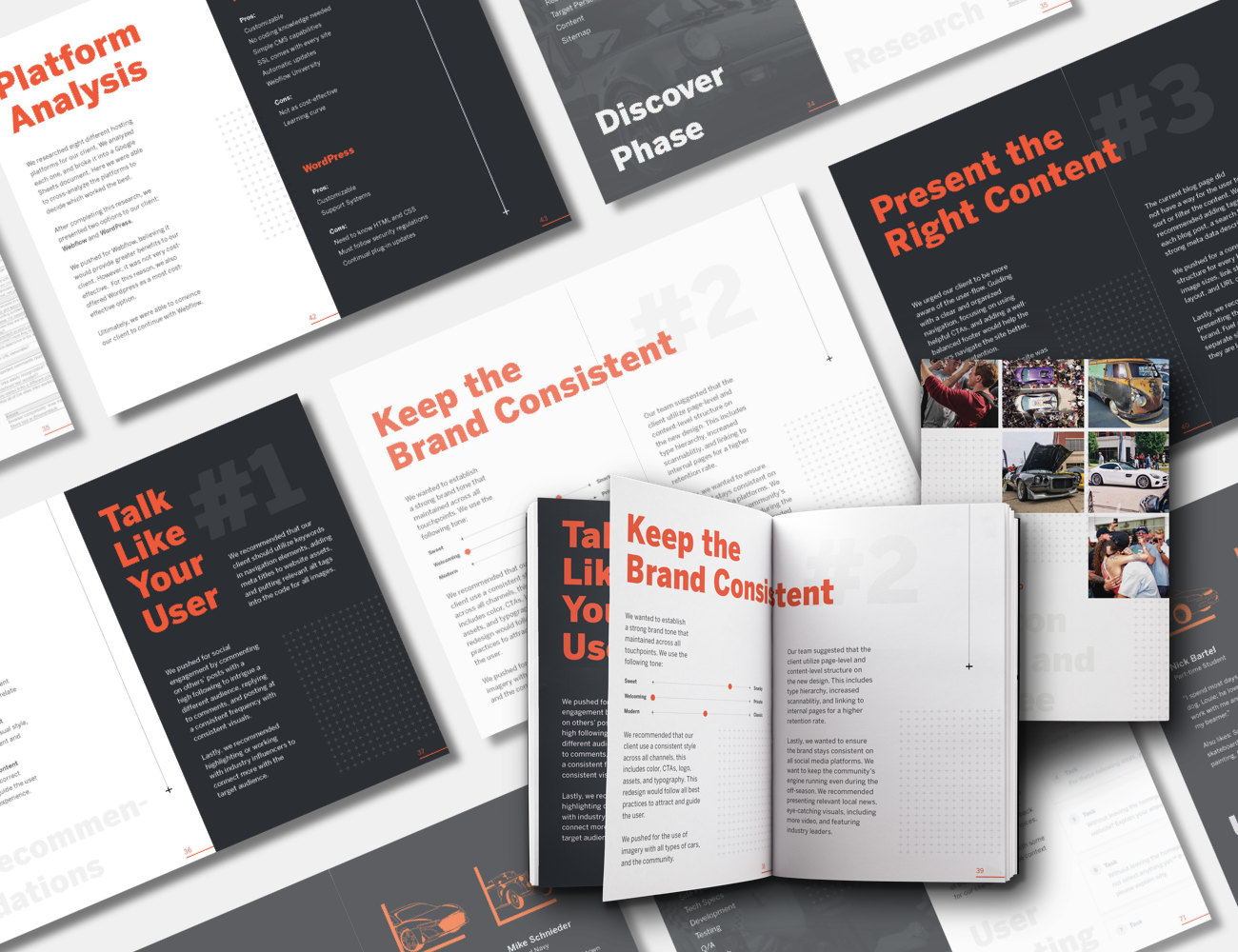
We developed three main recommendations for our client's digital presence: Talk Like Your User: Use relevant and engaging content that your target audience can relate to across channels. Keep the Brand Consistent: Ensure that your voice, visual style, and structure is consistent and recognizable. Present the Right Content: Provide useful and correct information and guide the user throughout the experience. We also created a platform analysis, and we recommended our client use Webflow.

We wanted to give the user the same experience they get while at a DCC event. We gave the information to the users the same way they would receive it if attending the event. We created six different wireframes, pieced together our best ideas, and started on design ideation. Each of us created style tiles, which became six separate homepage comps. After narrowing down the best design, we created the internal pages.