

This project was first created to help fix a problem many people with mental illness face: attending appointments. I believed this also bled into other issues like remembering to take prescribed medicine or following through with homework assignments. If I started digging, I knew I would hit a wicked problem. This project became less about a full-proof solution, and more about a way to ease a complex issue.
VIEW CASE STUDY BOOKLET
Once I started my research, I discovered the anxiety cycle. This chart represents how anxiety influences and reinforces avoidance overtime. The more a person avoids, the more anxiety grows. I believed stopping the cycle before the first temptation to avoid would help patients be more mindful in their actions. Research led me to believe I would need a cohesive and integrated system that starts with the therapist and ends with the patient. I ended with a modular and personalized software, an app that auto-syncs to the patient’s existing calendar, and a concept for a patient portal to include those who still use older media types.

Two research questions emerged: how might we simplify business operations to maximize client service? and how might we help clients manage their counseling services and mental health needs? To answer these, I surveyed my end user, conducted competitor audits, researched features, and user tested my content with card sorting. With this research I knew this system could work as a reminder and accountability solution for the patient. Each patient’s app could be customized from inside the software to fit their needs. If one patient needs more reminders throughout the week, the therapist can edit the reminders panel. While doing this, the software could work as an end-all-be-all for the business. Centralizing all information into one place, and making the process from start to finish a seamless one.

This first user test made it clear that all 65 features in one software would be overkill. So I decided to create a modular system. This system would allow the software to appear more customizable to each business, while also allowing Delta room to grow. New plugins could be added to the software at anytime, which will make bugs easier to fix when first released. Delta will now be able to integrate easier, with additional plugins, for services that were already being out-sourced. I created user personas, and a workflow to represent who can access what, to abide by HIPPA regulations.

I went through many rounds of wireframes, starting with low-fi prototypes. This helped me organize all of my thoughts, since the software had so much content to represent. Once I finished a few high-fi wireframes, I user tested them using Optimal Workshop's First Click Testing. I am very thankful for this tool, because it helped me see where my pain points were. Most of the tasks had a 8-20% success rate, so I had to declutter and rearrange. I ended up with a clean and cohesive design.

This design is customizable to each business with the colors, logo, and features. The therapist is able to build a customizable health plan for the patient, which links with their app and patient portal. At the same time, the software can be used for dynamic scheduling, visitor management, billing, and more. Having the information sectioned out into cards will help the user digest the information in a quick and effective way.

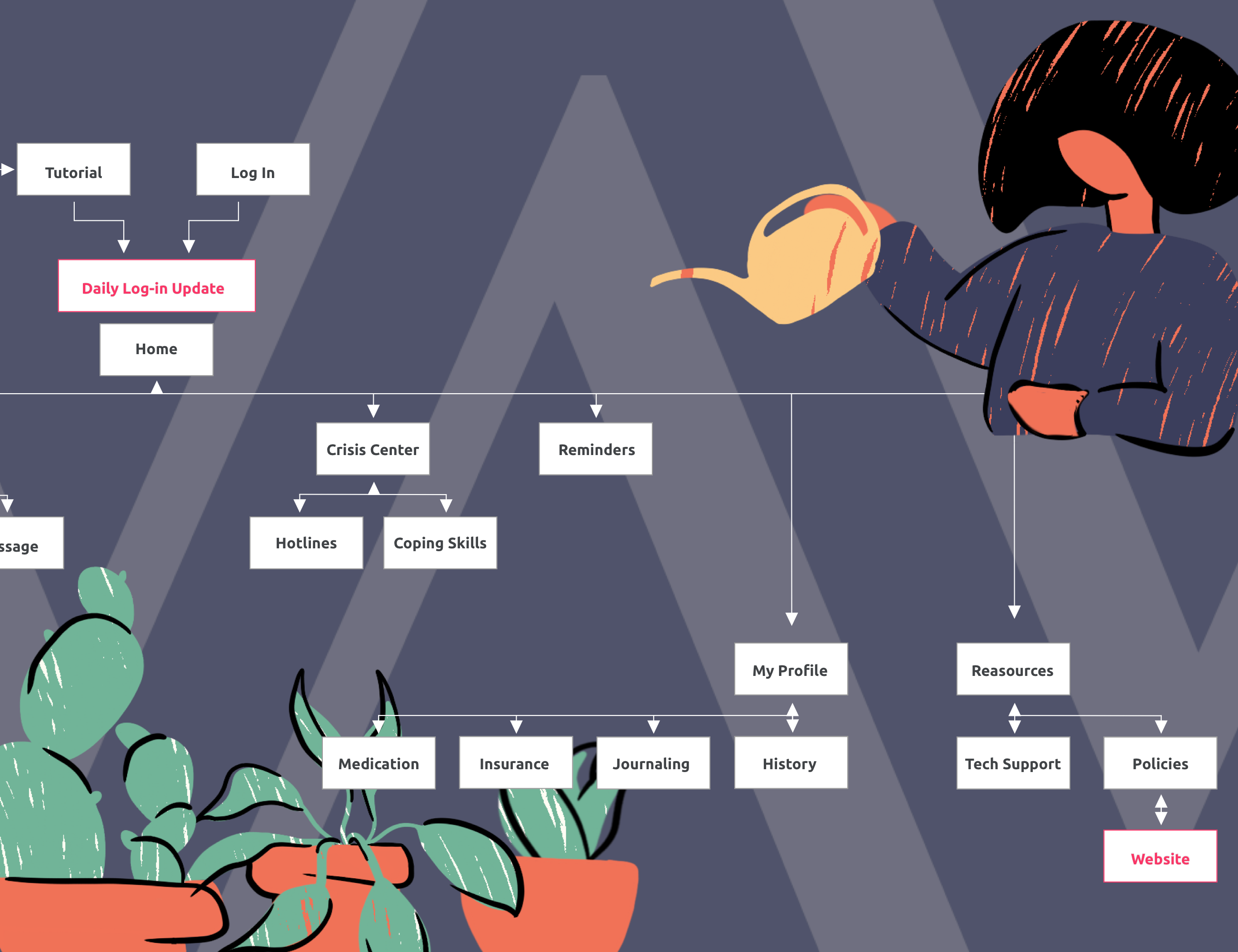
With less bulky content in this app, the user will not feel overwhelmed with information. In most cases, the user will be using this in a crisis, or in extreme emotion-mind. To help simplify that, no item requires more than three clicks to get to, which will allow for a less stressful environment. This app will also auto-sync appointments to any existing digital calendar in a discreet way. This way no private information will be seen on other calendars, but it will still be enough to gently remind the patient of their appointment. By allowing notification access, this app with help the patient stay more mindful of their mental state throughout the day, leading to a faster and more effective recovery.

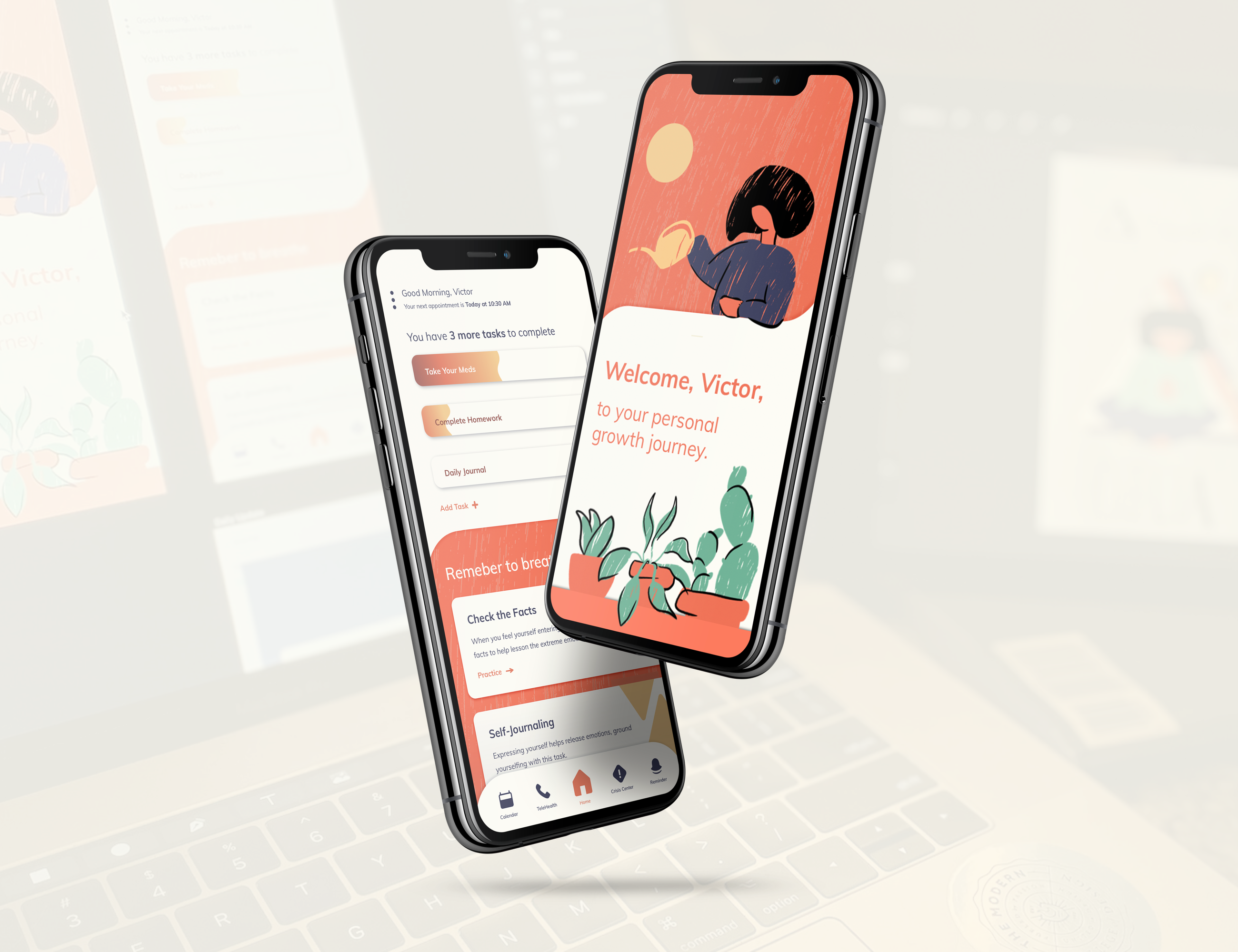
The patient portal is a web-app version of this app. This design used a texture that simulated rain, because rain has been found to provide a feeling of peace and calm. Its personalized to each patient, and the coping skills are easily accessed at all times on the home screen. The illustrative style seen here will be used to create simplistic animations throughout the app to add a bit of joy to the patient’s day. Everything in the app is displayed in a visual manner, such as the completion of tasks, to allow for quick and easy readability, in case the patient is in high levels of distress.